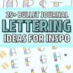
Rainbow Alphabet For Bullet Journal
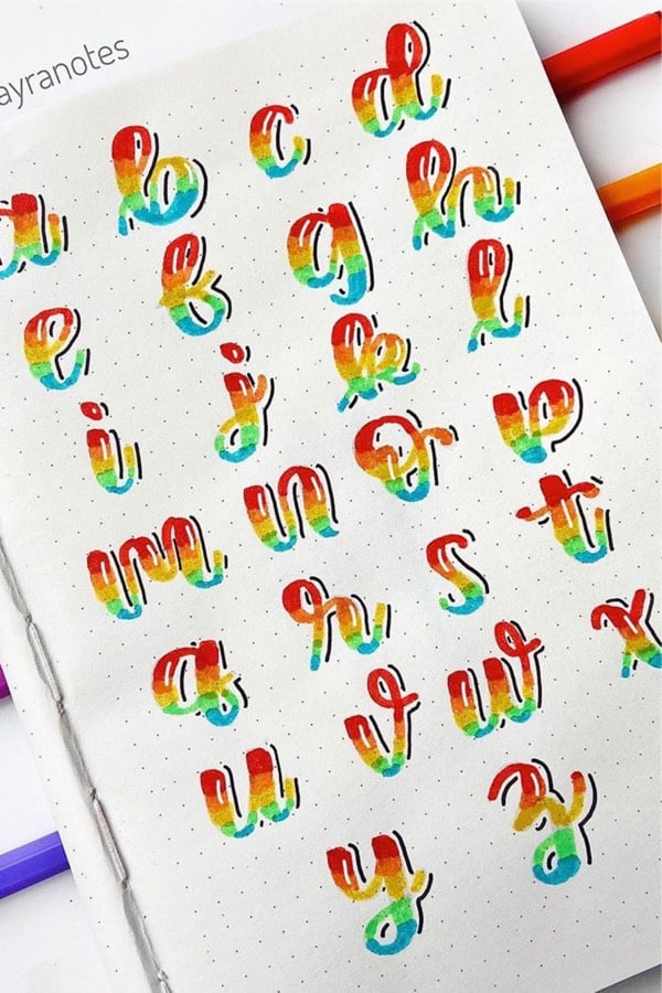
Photo credit: Mayra Ruiz on Instagram
Here’s a perfect example of how to use multiple colors in a single font while still making it look like everything works together. I would have to try some other colors out to see but… I think the colors she colors are perfect for this style. Plus, the way she used the white highlights on the letters and the black lowlights on the edges make it look less flat without going full bubble style!
Related Bujo Post: Bullet Journal Paper Notes Doodles
Light Blue Bujo Letters
Photo credit: Universoapuntes on Instagram
This light blue… almost muted blue colored font is a great example of the classic gradient and drop shadow style without going crazy with the color scheme. I could see something like this working well with a clean and simple layout while having the focus be on your headers!
90’s Style Bujo Font
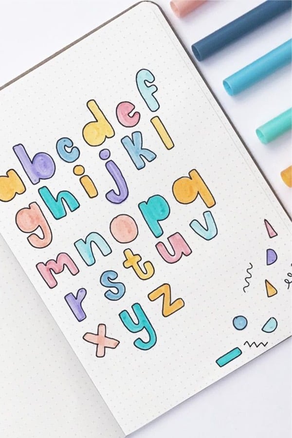
Photo credit: Mabel on Instagram
If you’re a fan of keeping things simple and like the flat-styled fonts… then this one might work well with your theme! She uses colors that aren’t really pastel but aren’t really super bright either which I think works perfectly with these letters. You could even take inspiration from those little doodles and use them throughout your spreads to add some fun color!
Related Posts:
📌 FOLLOW ME ON PINTEREST!
📌 PIN TO SAVE FOR LATER!
Related posts:
Best Black Bullet Journal Spread Inspiration For
Flower Doodles: Easy Step-by-Step Flower Drawing Ideas for Beginners
20 Best Pineapple Bullet Journal Spread Ideas For
30 Best September Mood Tracker Ideas For Bullet Journals
22 Super Fun Blue Bullet Journal Spreads For
Bullet Journal Instagram Tracker Setup With Ideas

- 35 Father’s Day Brunch Ideas That’ll Make Dad Feel Like a King - June 18, 2026
- What Gadget Lovers Should Know Before Buying a Robotic Pool Vacuum - June 17, 2026
- When a Parent Starts Struggling at Home - June 17, 2026
Leave a Reply