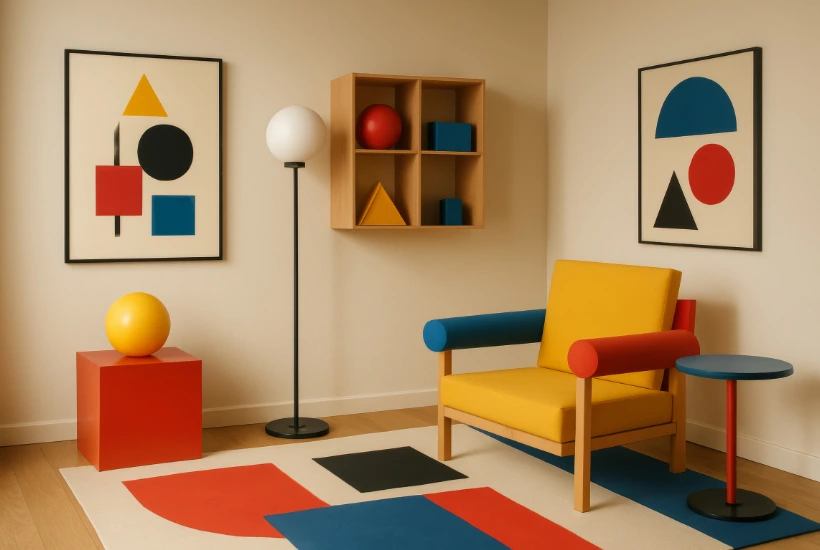
Wall art has moved from the final stage of decorating to a much earlier place in the design process. Homeowners increasingly use artwork to establish a room’s palette, mood, and visual hierarchy before selecting smaller accessories. That shift reflects a broader change in how people think about interiors, particularly as homes have become places for work, entertainment, rest, and socializing at the same time.
A painting or print is no longer expected merely to fill a blank wall. It can provide the emotional center of a room, create contrast against architectural finishes, or establish a sense of personality in an otherwise restrained space. The result is a decorating market in which art carries more responsibility, both aesthetically and emotionally.
The change is particularly visible in contemporary homes built around open floor plans and relatively simple architectural lines. Neutral upholstery, pale wood, stone surfaces, and understated cabinetry give homeowners considerable flexibility, but they can also produce rooms that feel impersonal without stronger visual elements.
Art is increasingly being asked to provide that missing layer of character. A large abstract composition can introduce movement into a quiet living room, while botanical photography can soften a highly structured kitchen or dining area. Even a modest print can alter the way surrounding furniture is perceived when its scale and placement are carefully considered.
For designers and consumers alike, artwork has become one of the most efficient ways to shift the emotional temperature of an interior without changing the room itself.
This evolution also explains why today’s art trends are unusually broad rather than dominated by one recognizable look. Minimalist abstraction remains influential, but so do expressive color, vintage-inspired landscapes, botanical compositions, graphic photography, and pieces that reference craft traditions. Consumers appear increasingly comfortable combining styles that would once have been kept separate.
A modern sofa may sit beneath a romantic landscape, while a traditional dining table may be paired with a sharply geometric print.
The common thread is not stylistic purity but intentional contrast. Modern decorating is becoming less concerned with whether every object belongs to the same design category and more concerned with whether the room feels coherent, layered, and personal.
Abstract Art Becomes More Expressive and Accessible
Abstract art remains one of the strongest categories in modern interiors because it can communicate emotion without dictating a specific narrative.
That flexibility makes it particularly useful in homes where furnishings already carry strong architectural or stylistic cues. Recent abstract work often combines broad gestures with softer palettes, layered forms, or deliberately imperfect geometry rather than relying solely on the severe minimalism associated with earlier contemporary interiors.
Curves, blurred edges, irregular blocks, and hand-drawn marks are appearing alongside cleaner geometric compositions. These elements bring movement to walls while remaining adaptable enough to work with a wide range of furniture styles.
The strongest abstract pieces today often feel spontaneous at first glance but reveal careful balance in color, negative space, and proportion.
That expanding range of styles has been matched by wider access to art itself, particularly through the growth of online marketplaces. These platforms make it easier for homeowners to compare artists, aesthetics, and presentation formats without relying on a single gallery or retailer.
Platforms such as iCanvas bring together work from independent artists, licensed estates, and cultural institutions, giving shoppers a broader view of the contemporary wall art market.
Browsing its collection of popular wall art can offer insight into the subjects and aesthetics currently attracting attention, while its resource on emerging art trends for 2026 can illustrate how preferences in color, subject matter, and artistic style are evolving.
For homeowners, resources like these can help establish a visual direction before selecting a specific piece, while also reflecting how art has become easier to discover across a wider range of interiors and budgets.
Accessibility may have broadened the audience for abstract art, but color remains one of the main reasons it works so effectively in modern interiors. Designers can use a composition containing rust, moss, cobalt, or ochre to repeat small colors already present in upholstery, rugs, books, or decorative objects.
Alternatively, the artwork can intentionally introduce a completely new color that gives the room more tension. This approach is especially useful in predominantly neutral spaces, where even a limited amount of saturated color can have considerable visual influence.
Abstract art also rewards experimentation with scale because its imagery does not depend on conventional perspective or recognizable subject matter. A composition that feels modest at poster size can become immersive when enlarged above a sectional sofa or dining table.
Nature-Inspired Art Moves Beyond Traditional Botanicals
Nature is returning to walls, but the current movement extends far beyond familiar floral prints and conventional landscape paintings. Contemporary nature-inspired art frequently explores fragments of the natural world rather than presenting complete scenes.
Close-up leaves, enlarged petals, rock formations, cloud studies, desert contours, waves, insects, and abstracted topography can all bring organic imagery into modern interiors without making them feel rustic.
Photographers and painters are also using unusual cropping, muted color treatments, and simplified silhouettes to make natural subjects compatible with streamlined furniture. The result is imagery that feels restorative without becoming decorative in a predictable way.
This makes nature-based art especially useful in urban homes where residents may want a stronger visual connection to outdoor environments.
Landscape art itself is undergoing a noticeable shift. Traditional scenic views are increasingly joined by hazy horizons, atmospheric forests, minimal seascapes, and compositions that blur the line between landscape and abstraction.
These pieces often rely on restrained colors and large areas of visual quiet, which makes them well suited to bedrooms, reading areas, and living rooms designed around calmness.
Warm earth colors have also become more prominent, with clay, sand, terracotta, olive, and deep green replacing the colder gray palettes that dominated many interiors in the previous decade.
Even dramatic landscapes are often treated with softened contrast rather than photographic realism. That restraint allows the art to contribute presence without overwhelming the architecture surrounding it.
The appeal of nature-inspired imagery also reflects a larger interest in interiors that feel restorative rather than merely polished. Natural light, indoor plants, textured materials, and organic shapes are already central to many contemporary homes, and artwork can reinforce the same visual language.
A botanical study beside linen upholstery or a coastal photograph above a pale oak console creates repetition between subject matter and material.
This relationship can make the room feel more integrated because the imagery echoes qualities already present in the physical environment.
Yet successful nature-inspired decorating rarely requires literal matching. A woodland scene does not need green furniture beneath it, just as a desert image does not require a Southwestern theme to feel appropriate.
Texture and Material Are Changing How Wall Art Is Experienced
The surface of an artwork has become almost as important as the image itself. As interiors move toward tactile materials such as boucle, plaster, limewash, unfinished wood, stone, linen, and woven textiles, perfectly flat wall decoration can sometimes feel disconnected from the rest of the room.
This has contributed to stronger interest in canvas textures, dimensional surfaces, layered paper, wood-mounted work, and other formats that create visible depth.
Even printed artwork can appear more substantial when the substrate interacts with light throughout the day. Texture becomes especially noticeable in rooms with restrained color palettes because differences in surface quality carry more visual weight.
In that setting, a relatively simple composition may have more presence than a highly detailed image printed on an unsuitable material.
Material choice can also alter the character of identical artwork. A photographic image on fine art paper may feel precise and traditional, while the same subject on acrylic glass can appear sharper, brighter, and more contemporary.
Canvas often softens an image and introduces a painterly quality, which can be useful when decorating rooms with relaxed furnishings. Wood can contribute warmth and natural variation, particularly when the image itself incorporates organic colors or outdoor subjects.
Metal tends to reinforce contrast and can suit graphic photography, architecture, or high-impact modern imagery. Selecting a medium therefore becomes part of the design decision rather than simply a question of reproduction quality.
The relationship between art and light deserves equal consideration. Reflective surfaces can add depth in rooms with controlled lighting, but they may produce distracting glare opposite large windows.
Matte paper and textured canvas usually behave more quietly under changing daylight, which can make them appropriate for bright living rooms and bedrooms. Directional picture lights can emphasize texture and provide an evening focal point, while recessed lighting can create a cleaner architectural effect.
Homeowners should also consider how artwork appears at different times of day rather than judging it only under showroom conditions. A piece that looks subdued in morning light may become significantly warmer near sunset, particularly if it contains earth pigments, metallic effects, or saturated reds.
Oversized Statements Are Replacing Filler Art
One of the clearest shifts in residential art is a growing preference for fewer pieces at larger scale. For years, homeowners often approached large walls by assembling multiple small frames, mirrors, and decorative objects. Gallery walls remain popular, but oversized artwork now offers an alternative for rooms that benefit from stronger visual focus.
A single large piece can make architecture feel more deliberate because it establishes a clear relationship between the wall and the furniture beneath it.
The approach is particularly effective above sofas, beds, consoles, and dining tables, where the artwork can visually anchor a major furnishing. Large-scale art also reduces the fragmented appearance that sometimes results when too many small objects compete for attention.
Scale, however, requires more thought than simply purchasing the largest piece that fits the available wall. Artwork should relate to the width and height of nearby furniture as well as the amount of negative space surrounding it.
A narrow print positioned above a long sectional may appear visually stranded even if the piece is attractive on its own. Conversely, artwork that extends too close to architectural edges can make the wall feel crowded.
Large rooms generally require more visual mass, but that mass can be achieved through one substantial work or through a tightly coordinated group. The objective is to create proportion rather than fill every available inch.
Oversized artwork is also changing the type of imagery people select. Enlarged photography, abstract forms, and simplified botanical compositions often work particularly well because they remain readable at a distance.
Highly detailed images can also succeed, but they may create more visual activity than a calm room requires.
Designers frequently use large works to introduce contrast against relatively simple interiors, allowing the piece to perform the role that an elaborate rug, patterned wallpaper, or sculptural light fixture might otherwise play.
This can make a room feel finished while keeping the furniture comparatively restrained. In smaller apartments, one large artwork can even make the room feel more expansive by replacing numerous small visual interruptions with a single strong gesture.
Gallery Walls Become More Curated and Less Formulaic
Gallery walls have not disappeared, but their composition is changing. The symmetrical grids and uniform black frames that became ubiquitous during the rise of social-media-driven interiors are giving way to looser, more collected arrangements.
Homeowners are increasingly combining photography, illustration, painting, typography, vintage imagery, and personal objects rather than repeating a single visual format.
Frame materials may vary as well, with wood, painted finishes, thin metal profiles, and occasional ornate frames appearing within the same installation. The best results feel accumulated rather than purchased as a complete kit. That sense of evolution gives the wall personality and makes it easier to add new pieces over time.
Successful eclectic arrangements still require discipline. A gallery wall can contain varied imagery while maintaining consistency through color, spacing, frame weight, or subject matter.
One method is to select several pieces with a shared tonal range while allowing the styles to differ. Another is to establish a clear anchor piece and arrange smaller works around it, creating hierarchy rather than treating every frame equally.
Consistent spacing can provide enough order to support otherwise unrelated imagery. Homeowners who prefer a more casual installation can vary spacing, but they should still pay attention to the outer silhouette created by the full collection.
Personal material is also playing a larger role in these arrangements. Family photographs, travel images, children’s drawings, antique documents, maps, and collected prints can sit alongside professionally produced artwork without diminishing the overall effect.
In fact, those combinations often prevent a room from resembling a catalog display. The key is editing, because sentimental importance does not automatically make every object visually compatible with every wall. Rotating personal pieces seasonally or keeping a larger archive can allow homeowners to preserve memories without displaying everything simultaneously.
A gallery wall works best when it tells a story that feels specific to the household rather than reproducing a formula seen elsewhere.
Earth Tones, Saturated Accents, and the Return of Warmth
Color trends in art increasingly mirror the broader movement away from cool gray interiors. Warm neutrals, clay shades, tobacco browns, muted yellows, forest greens, and softened reds have gained prominence as homeowners seek rooms that feel more grounded.
Artwork offers a comparatively low-risk way to introduce these tones because walls can carry richer color without requiring a major investment in furniture.
A print containing ochre or burnt orange can warm an otherwise pale room, while olive and moss tones can soften black, white, and metal finishes.
These palettes also pair naturally with materials such as oak, walnut, leather, stone, and linen. As a result, art can act as the bridge between color and material rather than functioning as an isolated decorative layer.
At the same time, saturated color is returning in more concentrated forms. Cobalt blue, vermilion, deep burgundy, chartreuse, and vivid pink are appearing as accents inside otherwise restrained compositions.
This reflects a broader willingness to use color strategically rather than cover an entire room with it.
A highly saturated artwork can provide enough intensity to make neutral furniture feel purposeful rather than cautious. The effect is especially powerful when one or two colors from the artwork are repeated elsewhere in small doses, perhaps through a lamp, cushion, ceramic object, or book spine.
Those repetitions create visual continuity without making the room feel overly coordinated.
Color selection should nevertheless start with the atmosphere a homeowner wants to create rather than with trend forecasts alone. Warm palettes tend to create intimacy, while cooler blues and greens often produce a quieter effect. High-contrast combinations can energize social spaces but may feel too active in bedrooms or reading rooms.
Dark artwork can add sophistication and depth, particularly on pale walls, while lighter compositions can relieve visually heavy furniture.
Natural daylight must also be considered because the same pigment can look dramatically different in north-facing and south-facing rooms. Trends provide a useful vocabulary, but the final choice should respond to the actual light, scale, and materials of the space.
Personal Taste Is Replacing Perfect Coordination
Perhaps the most important art trend is not a particular color or subject but a change in attitude toward decorating. Many homeowners are moving away from rooms in which every artwork, textile, and accessory appears to have been selected from the same collection. Instead, interiors are increasingly built around combinations that reveal interests, travel, cultural references, and individual taste.
This approach rewards patience because the room can develop gradually rather than being completed in a single shopping cycle. It also gives artwork greater significance, since pieces are chosen because they provoke a response rather than merely matching a sofa. The result can look less polished in a conventional sense but considerably more convincing as a lived-in environment.
This preference for individuality has helped expand interest in lesser-known artists and more specialized subjects.
Architectural photography, figurative illustration, vintage sporting imagery, folk-inspired patterns, surreal compositions, and historical reproductions can now appear comfortably within mainstream contemporary interiors. The growing range gives consumers permission to move beyond broadly appealing decorative imagery.
A homeowner who loves astronomy, for example, can integrate celestial artwork into a sophisticated room without turning the space into a theme. Someone interested in travel might combine a modern landscape with an antique map rather than relying on obvious destination photography. Specificity often makes a space feel more mature because the choices appear connected to the person living there.
Personalization does not mean ignoring visual cohesion. Rooms still benefit from repetition, balance, and thoughtful relationships between objects.
The difference is that cohesion can emerge from subtler connections than simple color matching. Two artworks might share similar line quality even if their subjects differ completely, or a carved wood frame might echo the tone of a nearby dining table.
A contemporary photograph and an older painting can coexist if their scale and placement create a balanced composition. When these relationships are intentional, mixing periods and styles gives a room depth that rigid coordination rarely achieves.
How to Choose Art That Outlasts the Trend Cycle
Trends are useful for discovering new ideas, but artwork is often more satisfying when it survives beyond the moment in which it was purchased. The first test is whether a piece remains interesting after repeated viewing. Furniture may be experienced largely through function, but artwork is encountered visually every day, sometimes for years.
Images selected only because they resemble current design photographs can lose appeal once the surrounding aesthetic changes.
A stronger choice usually has some combination of emotional resonance, visual complexity, craftsmanship, or personal relevance. The goal is not to avoid fashionable work but to distinguish between a genuine preference and a short-lived impulse.
Practical considerations matter as much as taste. Homeowners should measure the intended wall, examine sightlines from adjoining rooms, and consider how furniture may change in the future.
Framing and production format should suit both the artwork and the conditions in which it will be displayed. Humidity, direct sunlight, glare, and proximity to cooking areas can all influence what materials are appropriate.
Budget should also be distributed strategically, particularly in larger homes where not every wall requires an equally significant investment.
Spending more on a few visually important locations can produce a stronger result than spreading the same amount across numerous minor pieces.
The most successful modern interiors ultimately treat art as part of the architecture of daily life rather than as decoration added after everything else is finished. Abstract compositions can bring movement, nature-inspired imagery can introduce calm, and tactile materials can reinforce the physical character of a room.
Large-scale pieces can create focus, while carefully built gallery walls can communicate history and personality. Color can connect otherwise unrelated furnishings, and unexpected subject matter can prevent a home from feeling generic. None of those approaches requires rigid adherence to a single trend. The strongest rooms borrow selectively from current ideas while leaving enough space for individual taste to remain visible.
Related posts:
Why Preventive Maintenance Is the Secret to a Stress-Free Home
How To Block Light From Top & Side Of Curtains | 10 Tested Methods For 100% Darkness
Renovations That Improve Daily Living and Resale Value Tips
Designing Your Dream Kitchen on a Budget: Where to Save Without Sacrificing Style
From Basic Contractor to In-Demand Pro: How EPA Lead Paint Certification Can Skyrocket Your Career
30+ Inspirational Chalkboard Wall Quote Ideas For

- Which Water Pump Hose Is Best for Farm and Property Use in AU? - September 22, 2026
- From Abstract Prints to Nature-Inspired Decor: Art Trends for Modern Homes - September 22, 2026
- 5 Canadian Villages Where Fewer Than 20 Homes Change Hands a Year - September 22, 2026

Leave a Reply